The task
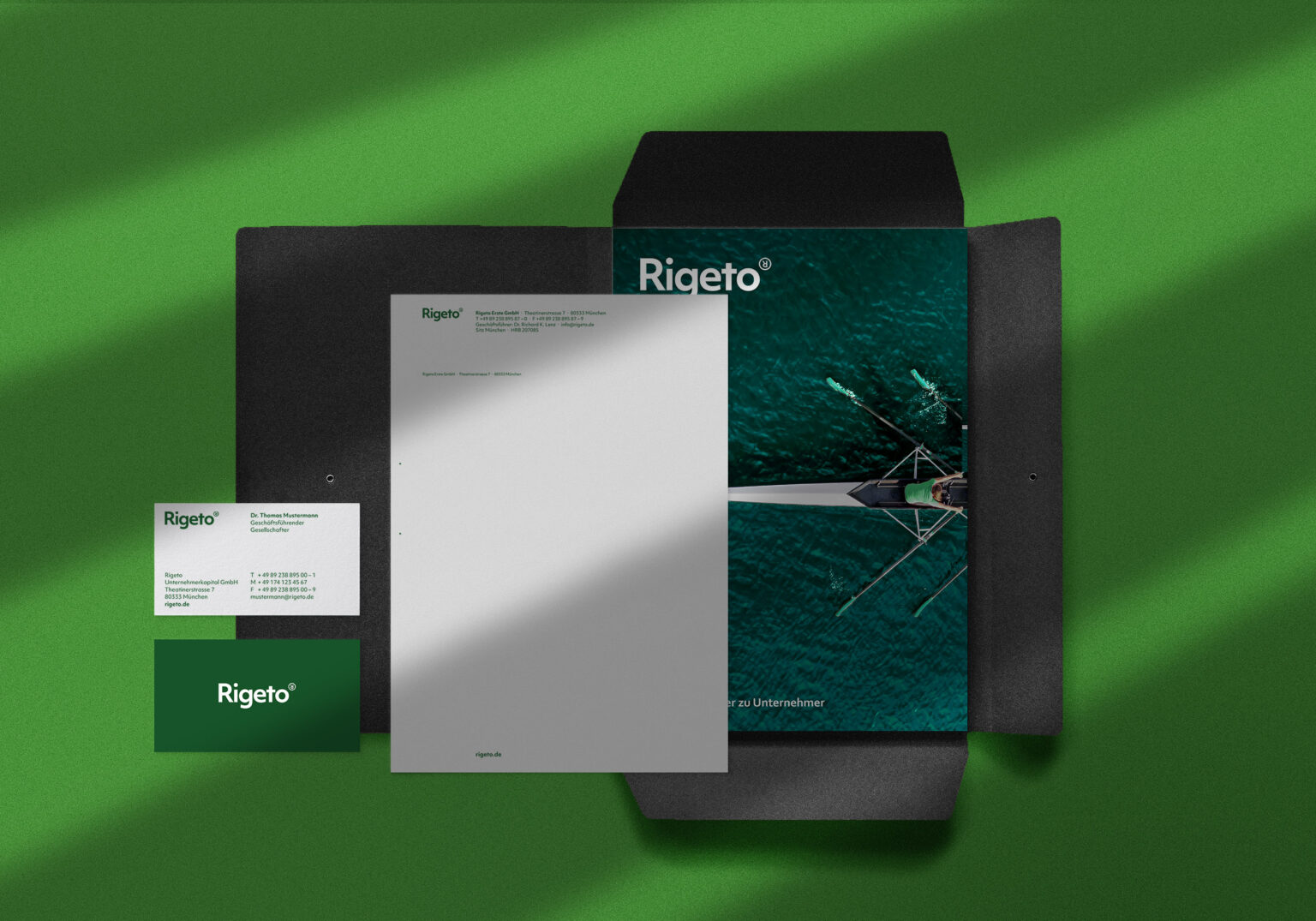
Rigeto is a private equity firm founded in 2013. In a short time, it became reputable as a reliable ally for companies in quest of corporate succession, strategic realignment, group carve-out and growth financing. With quite unconventional companies under its portfolio belt, Rigeto required a rebranding that will underline its outstanding identity.
The solution
We established a straightforward brand strategy with simplicity and a pinch of a surprising twist at its core. Carefully selected minimal but outstanding elements like the upside-down ®, are critical components in the design system. By coupling the bold typeface with the ownable upside-down ®, we brought elements of friendliness and swift provocation to the logo’s original essence.
For us at INTO, it was essential to retain the core identity while formalising a unique brand positioning and differentiating points in an industry characterised by intense competition.