Thus, a consistent brand appearance was created that transports the duality of tradition and modernity with a modern, timeless design. The long-standing identity of the brand was grasped in the course of interviews, brainstorming and joint brand-building workshops with the client. In the brand reorientation, special attention was paid to the spectrum and diversity of the target group members which include diverse industries, company sizes and even future talents for the Preu Bohlig team. Besides, the distinct closeness to the clients, which is paradigmatic for the brand and fosters a deep understanding of the clients’ needs, had to be communicated.
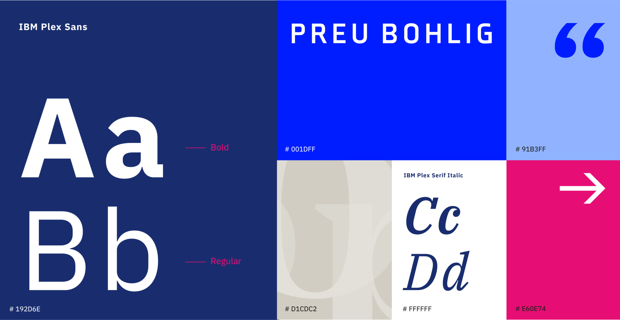
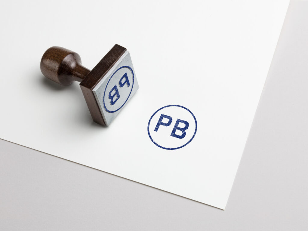
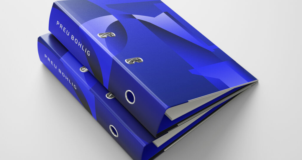
In the developed brand image, the modern and traditional aspects were combined: the wordmark is simple and slightly edgy, yet nicely crafted. With its primary colour dark blue, the colour scheme is robust; however, lots of white space and magenta highlights represent clarity and creativity. To highlight the human capital as a distinct strength of Preu Bohlig, typographic patterns were elaborated that take up the initials of the individual lawyers and personalise the back of their business cards. Finally, the website was completely set up anew to contemporarily represent Preu Bohlig also in the face-paced, digital world. The new appearance was introduced with the celebrations of the 60 years anniversary heralding a new era of the Preu Bohlig brand.